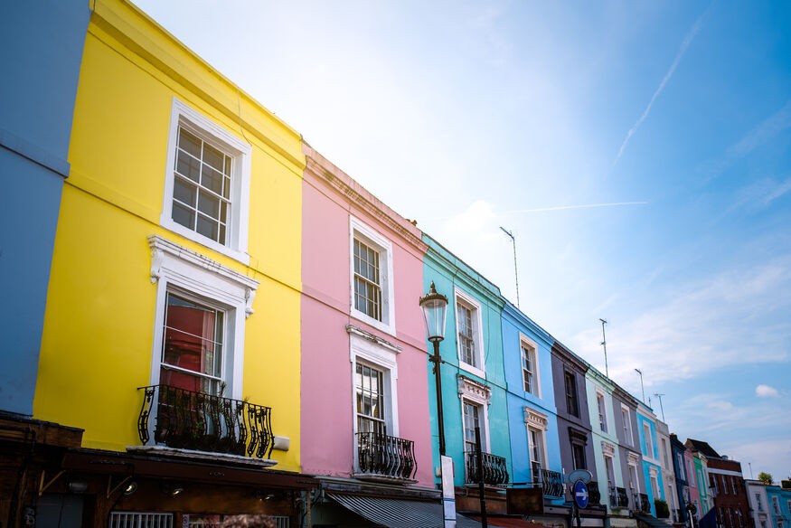
10 Inspiring Colours for Villa
Color choices influence how a villa feels as you move from one room to another. When selected with care, they support the architecture instead of competing with it.
Villa interiors behave differently from compact homes because the scale, daylight, and material finishes are far more pronounced. Large rooms, double-height spaces, and long sightlines make colour selection a practical design decision rather than a decorative layer. A well-planned palette can steady the visual flow between formal areas, private suites, and transitional spaces, allowing each zone to hold its own character without breaking continuity. Materials such as natural stone, warm timber, or textured plaster respond uniquely to different shades, so the colour has to work with what the villa already expresses. This list highlights tones that sit comfortably in spacious residential settings and support the way people actually use these environments, from everyday routines to hosting and quiet retreat.
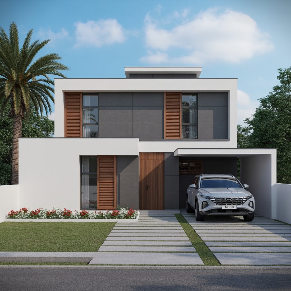
Colours That Complement Modern Villa Architecture
The following shades are selected to support open layouts, enhance natural lighting, and maintain visual balance without distracting from the architectural design.
Soft Ivory
Soft ivory settles well in villas where high ceilings and wide openings create shifting patterns of light through the day. The shade reduces harsh contrasts, allowing shadows to soften across large wall surfaces. It works particularly well with warm-toned lighting, which brings out its gentle warmth without turning the room yellow. Ivory gives enough contrast for elements like cornices, recessed bands, and moulded edges to read clearly, yet it doesn’t pull focus from the furniture layout or the natural materials already shaping the room.
Sand Beige
Sand beige suits villas that open toward coastal views, desert horizons, or landscaped surroundings where natural tones dominate the setting. It creates a steady visual line through long corridors, staircases, and interconnected living areas, reducing abrupt transitions between zones. The colour carries a quiet warmth that pairs cleanly with rattan, light timber, textured stone, or woven fabrics. In large spaces, it brings a grounded feeling without dulling the architecture, making it a reliable base for both minimalist and nature-led interior schemes.
Slate Grey
Slate grey suits rooms where the intention is clarity rather than brightness. In a study or media space, the colour holds the walls steady so the eyes settle quickly, which is why designers often use it around shelving, screens, or work zones. Its weight works well with darker timber or brushed metal, but it doesn’t overpower natural stone when used on a larger surface. The shade gives a room enough depth to feel composed, especially in villas where textures and built-ins need a background that doesn’t fight for attention.
Olive Green
Olive green works well in large dining areas and lounge spaces where the scale of the room can leave the walls feeling too bare. The colour introduces a quiet, natural softness that helps the space feel more composed, especially when the layout is open, and the sightlines are long. Under warm white lighting, olive green settles into a deeper, steadier tone that complements timber furniture, muted textiles, and matte wall finishes. In villa interiors, it brings an understated, organic character without altering the architectural intent.
Warm Terracotta
Warm terracotta often works best in courtyards and semi-open lounges because the colour holds its tone even when the light shifts. It introduces a calm warmth, not the brightness you see with stronger reds or orange-based shades. Villas built around Mediterranean or earthy themes usually take to it easily, since the colour sits well beside stone flooring, rough plaster, and natural textures. In these settings, terracotta doesn’t try to dominate the room; it simply steadies the palette and keeps the space visually grounded.
Dusty Blue
Dusty blue suits bedrooms and family areas, where the aim is to keep the room quiet and steady rather than decorative. The colour carries a muted tone that softens the walls without pushing the space toward a colder palette. As natural light changes through the day, the shade shifts slightly, which helps larger rooms feel settled instead of washed out. Designers often pair it with lighter wood and simple fabric textures because the colour supports those materials without drawing attention to itself.
Charcoal Black
Charcoal black is often introduced in measured portions to bring definition to a room. When applied to a feature wall, a niche, or a structural band, it sharpens the architectural lines and draws attention to the form rather than the colour itself. In larger villa rooms, designers use it to steady the composition and prevent the space from feeling visually loose. Charcoal also frames wide windows effectively, giving the outdoor view a clearer edge without overwhelming the rest of the interior palette.
Warm Taupe
Warm taupe works well in villas that use a mix of materials, because the colour sits comfortably beside marble, timber, and textured wall finishes without favouring one surface over another. It has enough warmth to hold large rooms together, especially when the layout is open, and the eye moves across several zones at once. Designers often use it as a steady backdrop so the palette stays cohesive but not repetitive. In these settings, taupe supports the architecture rather than introducing a new focal point.
Sage Green
Sage green is often brought into kitchens or reading corners when the aim is to keep the area calm but still give it a bit of freshness. The colour has a softened, almost muted character that works easily with pale wood shelves, hand-finished ceramics, or simple décor pieces. It holds its tone whether the room is bright or shaded, which helps in villas where the light shifts throughout the day. Designers use it when they want the space to feel steady and clean without adding a strong accent.
Sunrise Yellow
Sunrise yellow is used in darker hallways and stair landings because the softer shade brings a bit of brightness without creating glare. In north-facing rooms, where the light is cooler through most of the day, this muted yellow helps the space feel warmer and more welcoming. It lifts the wall tone just enough to counter the shadows but doesn’t push the colour into a bold accent. Designers choose it when a room needs gentle warmth rather than a strong visual statement.
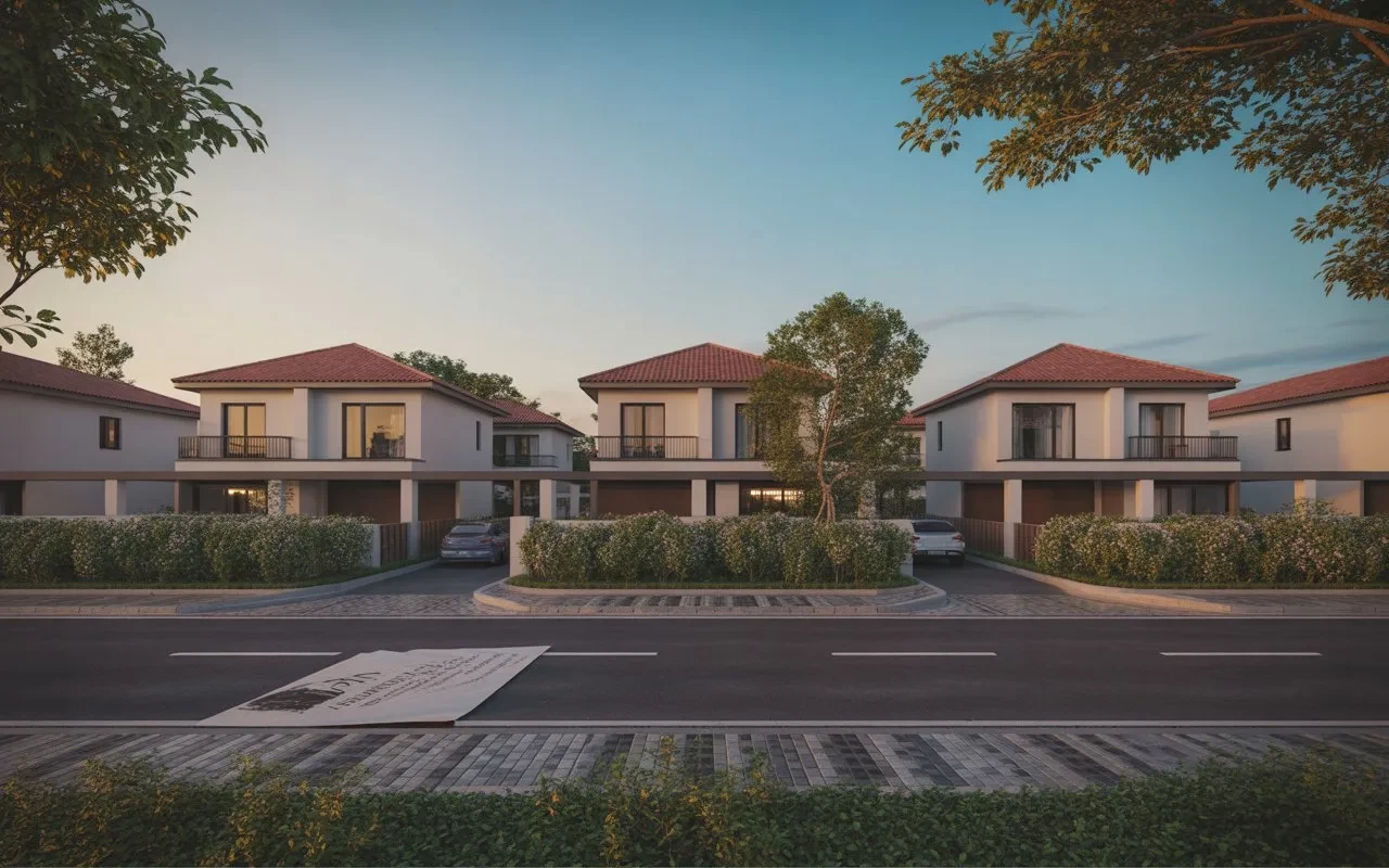
How Greentech Builders Design Villas for Better Colour Flow
With Greentech Builders, your luxury villa is built to embrace light, space, and colour—shaping an environment that reflects modern, elegant living. Colour has a direct influence on how a villa feels as you move from one area to another, especially when the rooms are large, and the natural light shifts through the day. A well-chosen shade can steady the proportions of a space, soften strong architectural lines, or bring clarity to areas that tend to remain dim. Designers usually test options on site sample boards, swatches, and small painted sections so they can see how each tone behaves under actual lighting conditions. This step prevents surprises once the full palette is applied. When the colours work together, the interior gains a quieter balance, and the architecture reads more clearly in daily use.
Contact us to know more about how to choose the right builder for your home project
Related Blogs
Apartment vs Villa - Which Is the Smarter Choice for Kochi Homebuyers
Choosing between an apartment and a villa in Kochi depends on your lifestyle, budget, and long-term goals. This blog explores the key differences in privacy, maintenance, security, convenience, and investment potential to help homebuyers make an informed decision.
Top Construction Companies In Kochi: How To Choose The Right Builder For Your Home
Discover how to choose the right builder for your dream home in Kochi with expert insights on reputation, quality, and smart decision-making
Best Villas for Sale in Kochi: A Complete Guide for Homebuyers
A complete guide for homebuyers looking for the best villas for sale in Kochi. Covers key buying factors, top villa projects by Greentech Builders, and why Kochi is the ideal city for villa living in 2026.
Benefits of Owning a Luxury Villa Project in Kochi
Highlights the key benefits of owning a luxury villa project in Kochi, including privacy, spacious living, premium amenities, and long-term investment value. It also explains why Kochi is a preferred destination for modern homebuyers seeking a comfortable and high-quality lifestyle

How to Choose Budget Home Builders in Kerala Without Compromising Quality
Greentech Builders explains how budget home builders in Kerala help homeowners achieve the right balance between cost and quality. Highlights key factors to consider before choosing a builder, practical tips to reduce construction costs, and the importance of planning and transparency during the building process. It also showcases how experienced builders deliver durable, well-designed homes without exceeding budget, making them a reliable choice for modern home construction in Kerala.

How Villas in Kochi Support IT Professionals?
Villas in Kochi for Greentech Builders offer IT professionals a perfect blend of comfort and convenience. With spacious layouts, peaceful surroundings, and easy access to tech hubs in Kochi, these villas support a balanced work-from-home lifestyle.
